News: Now offering a 90-day money-back guarantee!
Learn more
News: Now offering a 90-day money-back guarantee!
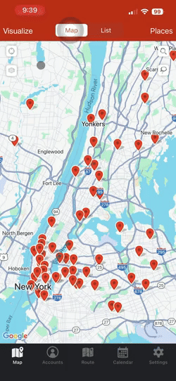
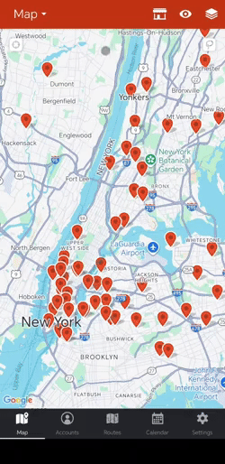
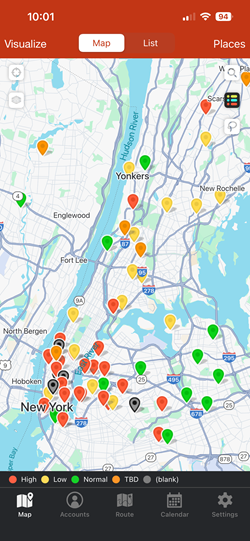
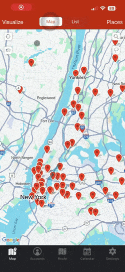
Learn moreThe Visualize tab was designed for stress-free territory management. Use the “Colorize” and “Filter” in the Visualize tab to color your pins by key values and filter out accounts you do not want to see on your map. You can easily organize and segment your accounts before making any changes like creating routes and updating account information.

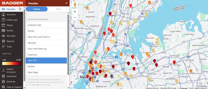
Use Colorize to see your pins as different colors based on the fields associated with accounts that you’ve imported into Badger Maps. You’ll be able to see the bigger picture of your accounts in one glance without going through lines of data.
Use Colorize to:

Use Filter to sort out certain accounts on your map to show the only accounts you want to see and how you would like to see them.
Use Filter to:
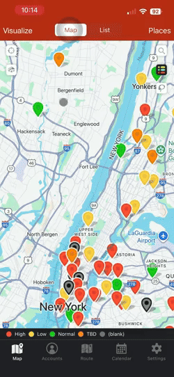
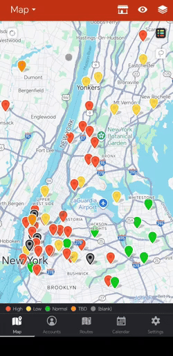
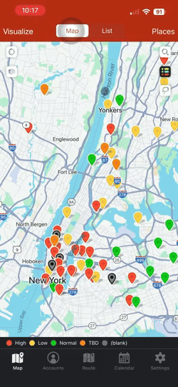
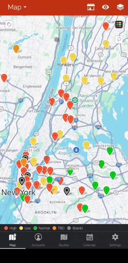
Text filters colorize your pins according to text values. Examples of text filters are Priority (with values like High, Medium, and Low) and Type of Business (with values like Clinic, Store, Car Dealership, etc.). This way, if you only wanted to see Car Dealerships that High Priority, you can filter out all other accounts and create a route for the accounts left on your screen.
When you colorize by text filters, your accounts will be assigned different colors and displayed on your map.

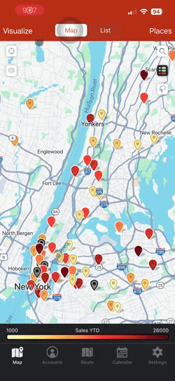
Numeric filters colorize your pins according to the number in the field you choose to filter. You can only assign number values for numeric filters in order to filter it.
Your accounts will be colorized based on a gradient scale from yellow to dark red. For example, the “Days Since Last Check-In” filter will color code the accounts you saw yesterday in yellow and the ones you haven’t seen in a month in dark red.
In the Filter tab you can customize the scale by using the slider or typing in your own numbers. Then you’ll only see the accounts in that range on your map.

TIP: You can use text and numeric filters at the same time! Use a text and numeric filter at the same time to see where specific accounts are. For example, you can use the filters to see High Priority accounts with Sales YTD between $5k-$10k.
Beware! If you have too many filters active your pins may not appear on the map. You can see which filters are active under “Visualize” and the grey banner, “Active Filters.”
To reset your filters and see all your pins:
1. Go to Visualize.
2. Click on Filters.
3. Click on the blue banner for Reset Filters.
If your pins are still hidden, refresh your page. If the problem persists, email us at support@badgermapping.com with any questions or concerns.
To create new filters, you can either create them manually from the web app or through an Excel/CSV import.
It’s useful to manually create fields in the web app when you would like to add a new field that (1) you would like to fill out in the future and don’t have much data yet for or (2) if the field can easily be filled out with the Lasso tool.
It’s useful to create fields with a spreadsheet when you already have this data stored somewhere else, like a customer data spreadsheet or in your CRM.
1. Go to Settings.
2. Under Data Management, click on Manage Fields.
3. Scroll to the bottom of that new window.
4. Click on Add new field, and type in the name of the filter.
5. Choose the filter type (text or numeric).
6. Now, you can start assigning values from your new filter to your customers in Account Details.

1. Create a new column in your spreadsheet.
2. Add the field name as the new column’s header. Make sure to add the column as the last column on the right in your spreadsheet. You can download an excel/CSV template here.
3. Under your new header, add values from your field in the rows of the accounts they’re associated with. For example, if your new header is “Purchasing Stage,” add the status of that lead or customer in the correct row under that header.
4. Import your spreadsheet to Badger through Settings or Import Accounts button.
Before:

After:

1. Open the account details of the Account you would like to edit.
2. Click on the grey pencil icon next to the field you’d like to edit.
3. Type in the new value or choose an existing value in the field and save.

1. Tap the account pin that you would like to edit, and tap its name at the bottom of the screen.
2. Click Edit, update the field that you need to edit, and tap Save.
1. Tap the account pin that you need to edit, and tap the account’s name at the bottom of the screen.
2. Then click Edit, update the field that you have to edit, and then tap Save.
1. Go to Tools, choose Lasso, and draw around the accounts you’d like to edit filter values for.
2. Click on Mass Update on the bottom of the screen.
3. Find the filter you want to add or edit the value for those customers, click on it, and add or edit that value.
4. Click on Update Accounts and the accounts you selected through Lasso will reflect the new values.
Tip: Lasso is great for assigning territories. If you have a team in Badger, you can use Lasso to draw a circle around a group of points and change/add an account owner.

1. Tap the Lasso icon, and draw around the pins that you have to update.
2. Choose Mass Update, update the field that you need to edit, and tap Update Accounts.
1. Tap the Lasso tool, and draw around the accounts that you need to edit.
2. Select Bulk Edit, update the field that you want to edit, and tap Update Accounts.
The order of filters can be customized:
1. Go to Settings.
2. Under Data Management, click on Manage Fields.
3. Reorder your filters by clicking on the 3 grey lines next to one of the filters and then drag it into place.

To colorize and filter your accounts based on Sales Stages, make sure you have a field called “Sales Stage” and your account details have this field filled out.
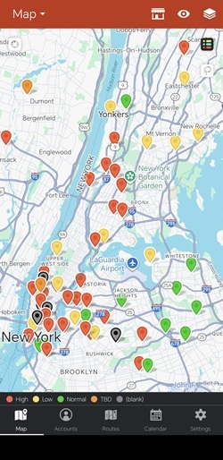
To colorize accounts by their Sales Stage:
1. Click on the Visualize tab.
2. Make sure you’re in the Colorize section to color code your pins.
3. Select Sales Stage, and the pins will be colored based on what Sales Stage they’re in.
Now your pins will be colored by which sales stage they’re in with a legend on the left side of your screen. Now that you have your pins colorized, what if you only wanted to visit Inactive accounts under the Sales Stage filter?
You can filter your map so that only “Inactive" accounts stay on your map:
1. Click on the Visualize tab.
2. Make sure you’re in the Filter section and scroll down to the Sales Stage Filter.
3. Un-check or toggle off the Sales Stages that you would no longer like to see.
4. Your map will now show only your qualified leads.
When you’re finished, click Toggle All On to bring back the rest of your accounts on the screen.


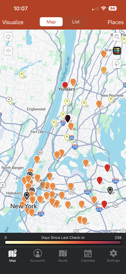
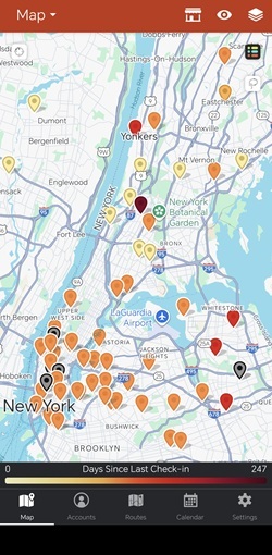
Did you know that you can also visualize your data based on the days since you’ve lasted visited a client? Once you’ve saved a check-in, Badger Maps automatically calculates the number of days since your last check-in and saves it. You no longer have to manually keep track of when you last visited a lead or customer.
To colorize your data based on days since last check-in:
1. Go to the Visualize tab.
2. Click on Colorize.
3. Scroll down to the Days Since Last Check-In filter and select it to colorize.
Since this is a numeric filter, the left panel will show a gradient scale. The darker the pin’s color, the longer it’s been since you’ve last visited that client.
For example, if you would like to visit accounts that you haven't seen in the last 100 days:
1. Go to the Visualize tab.
2. Click on Filter.
3. Scroll down to the Days Since Last Check-In Filter.
4. Change the input on the left to be 100 and only accounts you have NOT visited in the last 100 days will be left on your map.
If you’re in a team you’ll be able to colorize and filter by territories as well. To improve sales efficiency, it’s important to see what your reps’ territories look like to know that they have the ideal territory for their skills and region.
To visualize and filter by territory, go into the “Visualize” tab and select the “Rep Names” colorize filter. This will color each pin on your map by each team member’s territory. Then, you can use “Filter” to filter out territories you would not like to see on your map.

The video below shows you how to use visualization tools to colorize and filter your accounts on the map on your computer.
Looking for our logo?
Grab a Zip packed with our logo in PNG and EPS formats.