News: Now offering a 90-day money-back guarantee!
Learn more
News: Now offering a 90-day money-back guarantee!
Learn moreAs you know, Badger's Visualize tool has a Colorize function that allows you to color code the accounts according to a specific filter. The color options are predetermined, and they appear in a chronological order. Here’s what you’ll do if you want to match the colors with a particular filter or value.
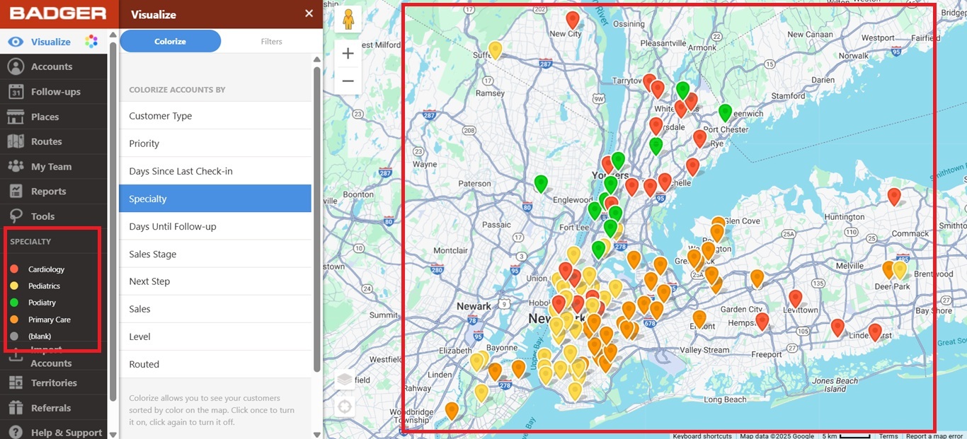
1. First, you’d have to know how the colors show up, and the picture below shows the color guide. They appear from left to right with the last one assigned to accounts that have blank filters.

2. Now, let’s go to our example. In this one, under the Specialty field, let’s say you’d like Cardiology to appear in yellow, Pediatrics in green, Primary Care in red orange, and Podiatry in orange.
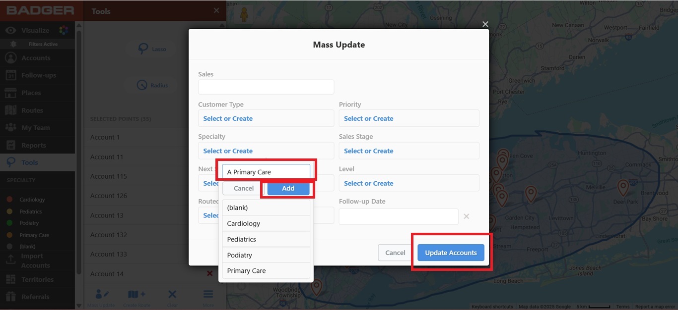
3. The next thing you’ll do is edit the filters by adding a letter in front of each filter name. Note that each letter should correspond to how the colors appear on the guide (ex. A Primary Care so it’ll appear in red, B Cardiology so it’ll be in yellow, and so on). Click here if you want to learn how to edit filters.
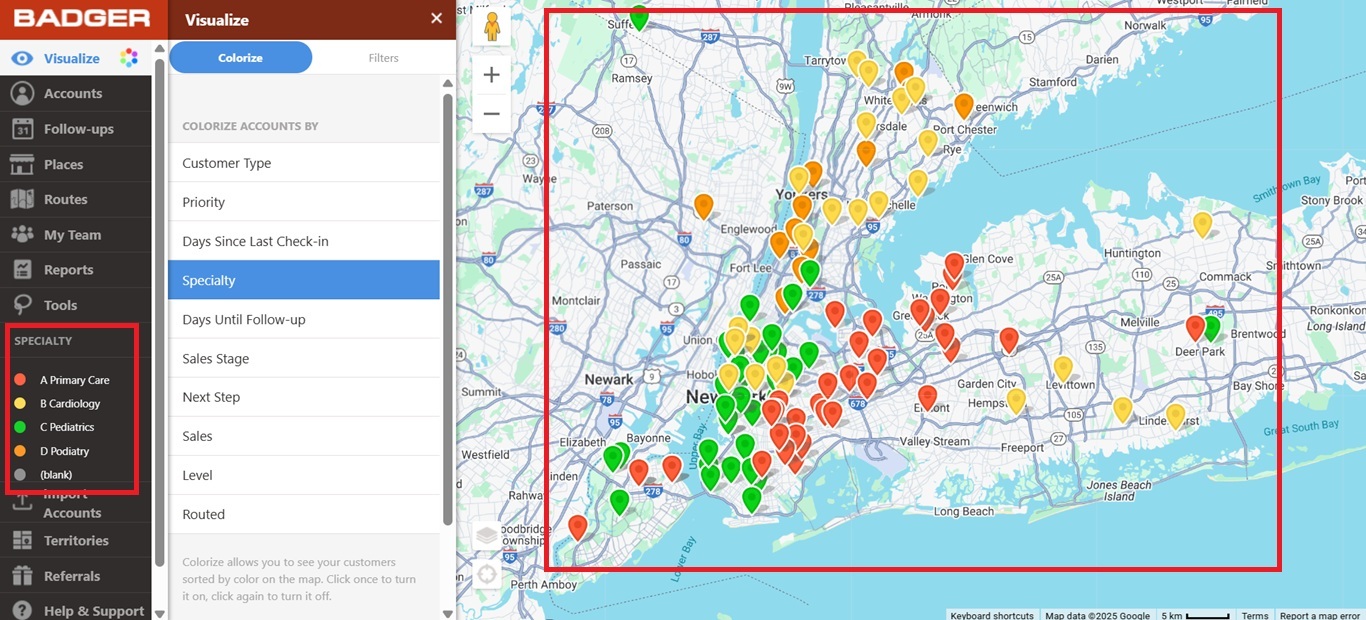
4. And that’s it. You’re good to go after editing each filter. Below is how it would look once you’re done editing.
Looking for our logo?
Grab a Zip packed with our logo in PNG and EPS formats.