News: Now offering a 90-day money-back guarantee!
Learn more
News: Now offering a 90-day money-back guarantee!
Learn moreDo you need to map your territory based on a certain attribute? Don’t worry, Badger Maps created the Visualize feature to help you with this. This function lets you color-code and filter your accounts so you can have a good picture of your territory. Continue reading to find out how this works on our iPhone app.
First, let us teach you how to color-code your accounts. In this example, we’ve assigned each account a priority to demonstrate how this functionality works.
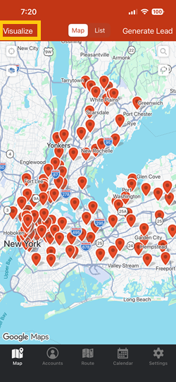
1. Open the Badger Maps app, and go to Visualize.
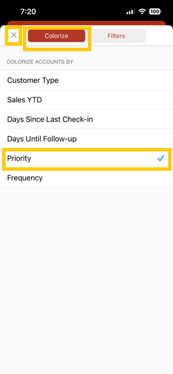
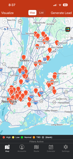
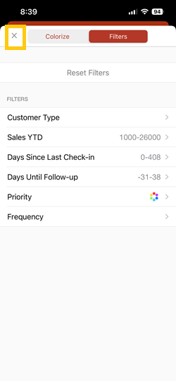
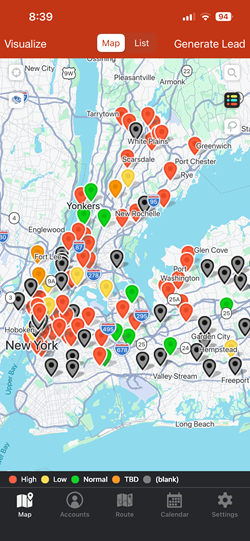
2. Choose Colorize, tap Priority, and hit the X icon to go back to the Map screen. You should see that the pins changed their color.

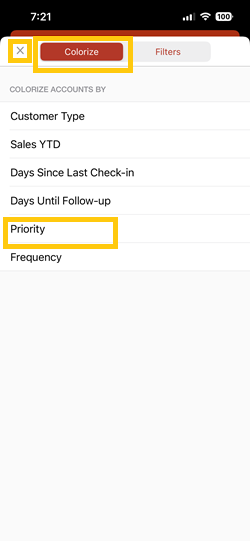
3. To bring back the pins in their default color, you’d have to go back to Visualize, then Colorize, click Priority, and tap the X icon again.


Now, let’s try to filter the data to show just the high priority customers on the map. Here are the steps.
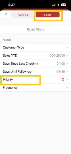
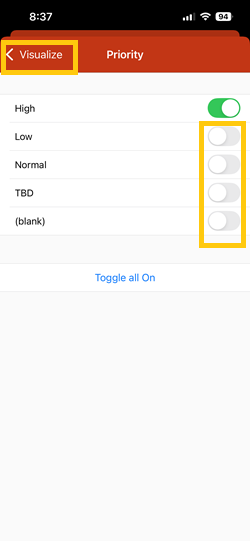
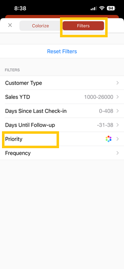
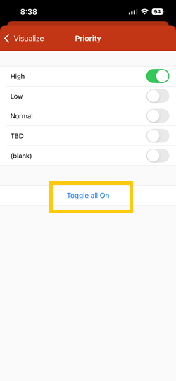
1. Go to Visualize, this time tap Filters, and click Priority.

2. Toggle everything off by tapping the sliders beside each sub-category. Leave High toggled on. Then click Visualize, and tap the X icon again to go back to the Map screen.
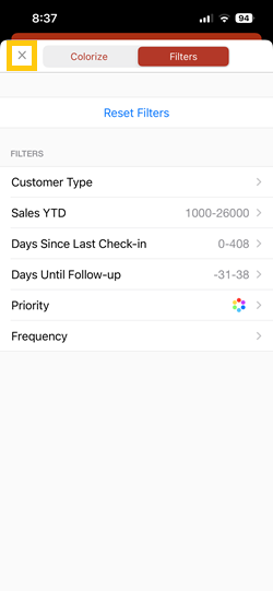
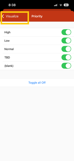
3. To bring back the rest of the pins, tap Visualize again, then go to Filters, and click Priority.

4. Then Toggle all On, hit Visualize, and tap the X icon.
Note: You can use two or more filters at the same time.
That’s it. You just learned how to Visualize your data on our iPhone app. Happy selling!
Looking for our logo?
Grab a Zip packed with our logo in PNG and EPS formats.