News: Now offering a 90-day money-back guarantee!
Learn more
News: Now offering a 90-day money-back guarantee!
Learn moreBadger Maps’ Visualize feature helps you view your territory in the most efficient way by allowing you to color-code and filter your data based on a specific category. Keep on reading to find out how to use this on our Android app.
First, let’s talk about how you can color-code your accounts. In this example, we’ve assigned each account a priority to demonstrate how this feature works.
1. Tap the eye icon on the upper right part of the Map screen to go to Visualize.

2. Then, tap Colorize, choose Priority, and click the X icon beside Visualize to go back to the Map screen.

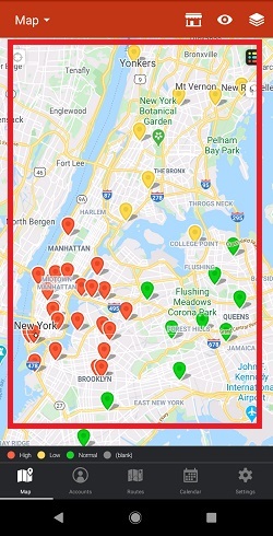
3. To bring back the pins to their default color, go back to Visualize, tap Priority, and click the X icon again.


Now, let’s say you just wanted to see high priority customers on the map. Here’s what you’ll do.
1. Go to Visualize, then tap Filters, and click Priority.


2. Toggle off everything by tapping the slider beside each sub-category. Leave High toggled on, then hit the arrow icon beside Priority, and tap the X icon beside Visualize to go back to the Map screen.


3. To bring back all the accounts on the map, go back to Visualize, then click Filters, and go to Priority.


4. Then tap TOGGLE ALL ON, click the arrow icon, and hit the X icon on the Visualize screen.


Note: You can use two or more filters at the same time.
And that’s it. You just learned how to use Visualize on our Android app. Happy selling!
Looking for our logo?
Grab a Zip packed with our logo in PNG and EPS formats.