News: Now offering a 90-day money-back guarantee!
Learn more
News: Now offering a 90-day money-back guarantee!
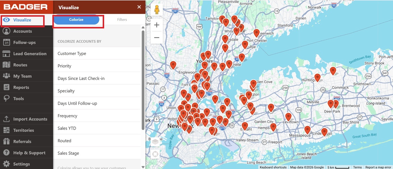
Learn moreBadger’s Visualize feature allows you to view your territory in the most efficient way. This function lets you color code and filter your accounts based on certain attributes. In the example below, we will use the customers’ specialty to demonstrate how this feature works.
Here’s what you need to do to color code your clients:
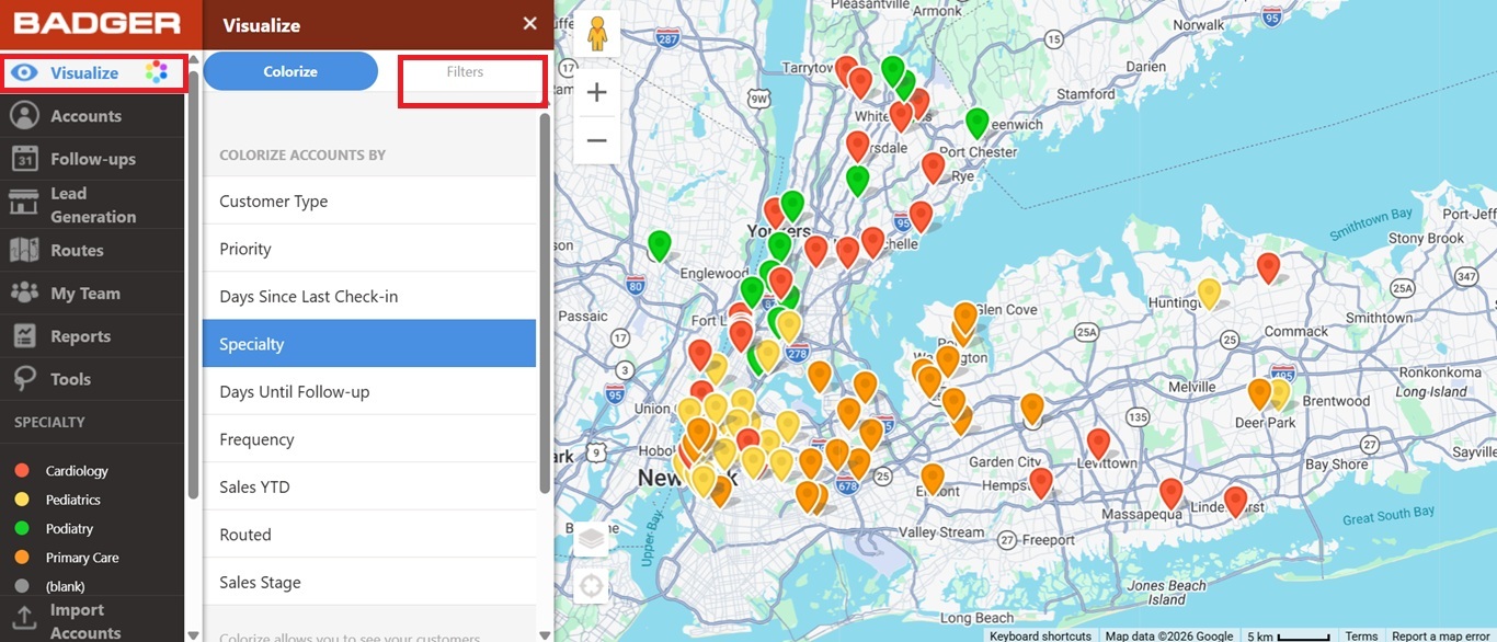
1. On the Badger Maps web app, go to Visualize and click Colorize.
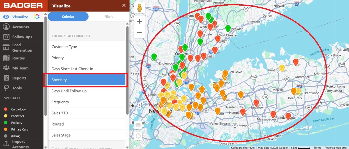
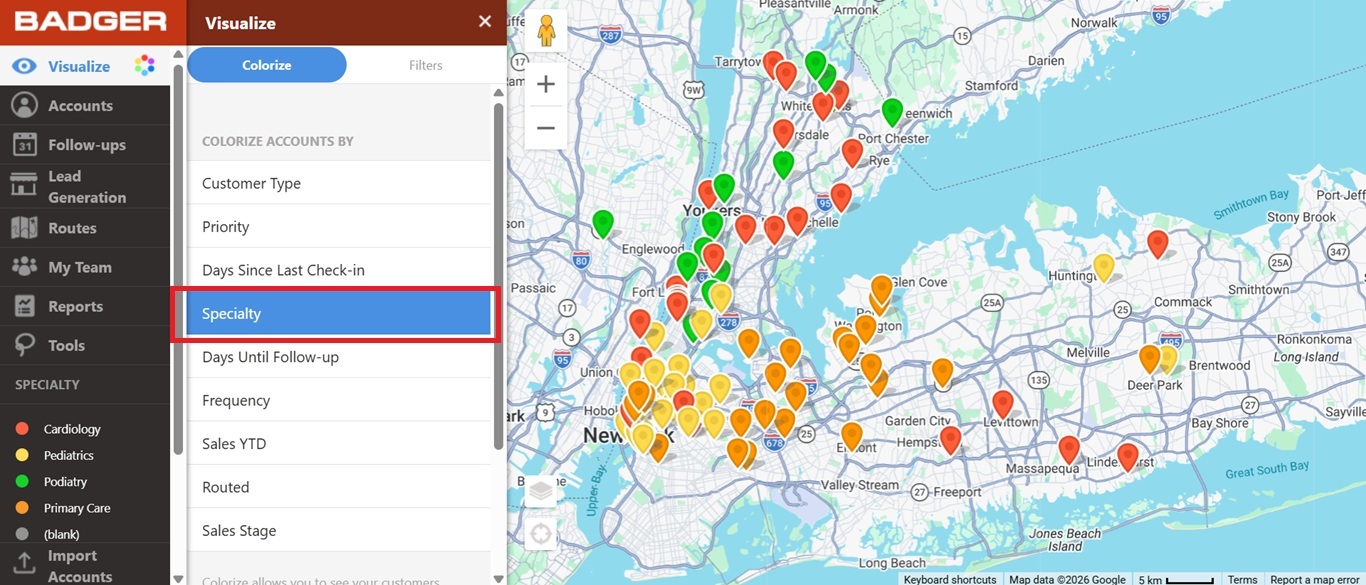
2. Then scroll down and click Specialty. You’ll see that the pins have changed their colors.
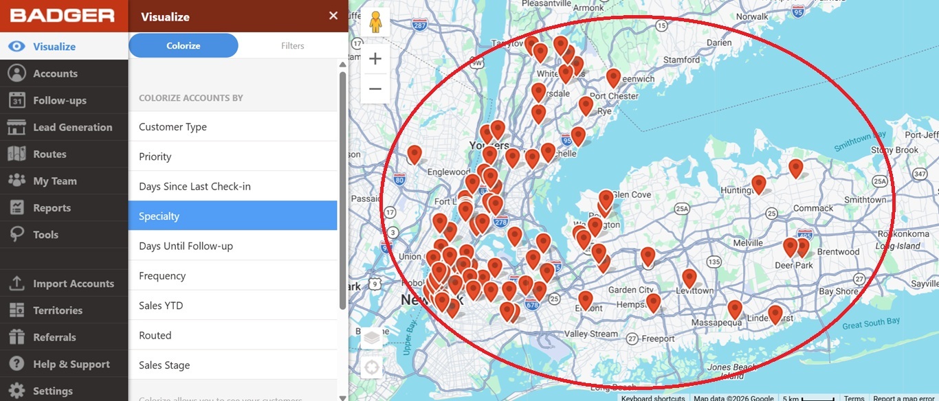
3. Click Specialty again to bring back the pins to their default color.
Now, let’s say you just wanted to see customers who specialize in Primary Care. Here’s what you’ll do:
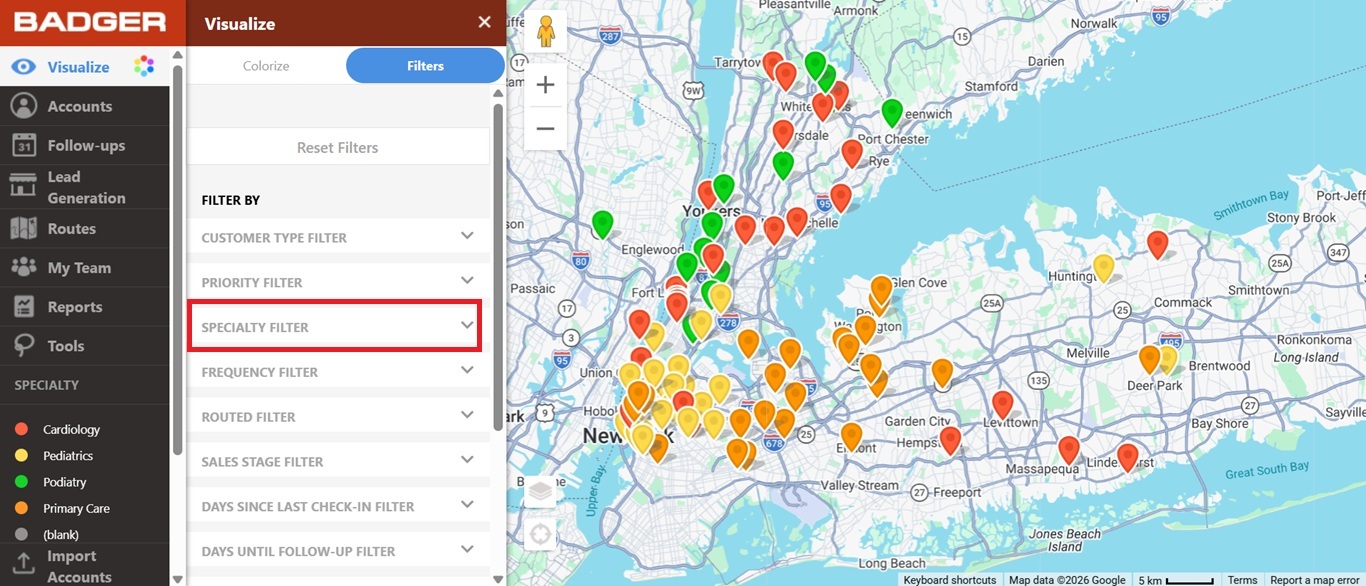
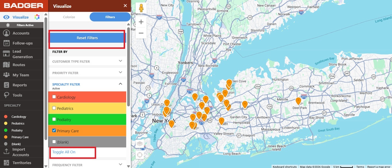
1. On the Badger Maps web app, go to Visualize and click Filters.
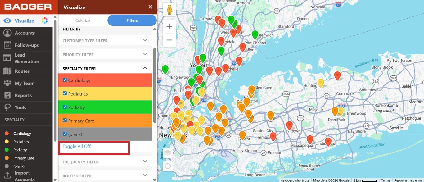
2. Then look for the Specialty Filter, click Toggle All Off, and check the Primary Care box. This action will only show accounts who specialize in Primary Care.
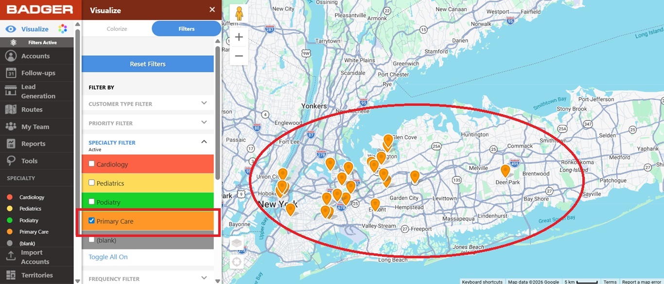
3. Click Toggle All On or the Reset Filters button to bring all the accounts back on the map.
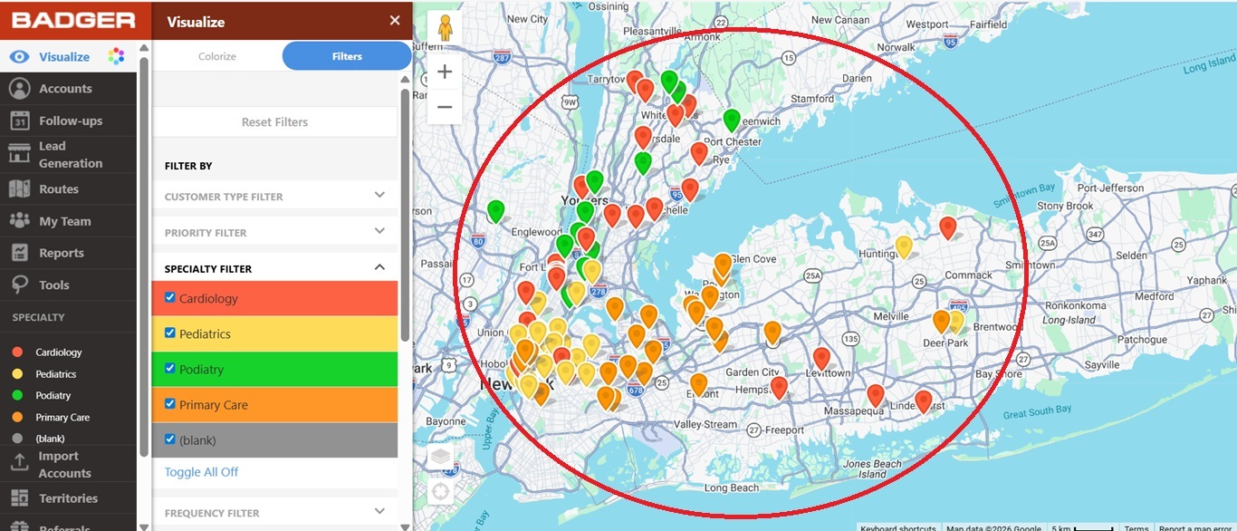
Note: You can use two or more filters at the same time.
The video below shows you how to use visualization tools to colorize and filter your accounts on the map on your computer.
Looking for our logo?
Grab a Zip packed with our logo in PNG and EPS formats.