Jak kolorować / filtrować moje dane (WebApp)
Badger's Visualize feature allows you to view your territory in a way that is most effective for you. Create and import relevant categories for your data, such as "customer type" or "sales stage", to further organize your account details.
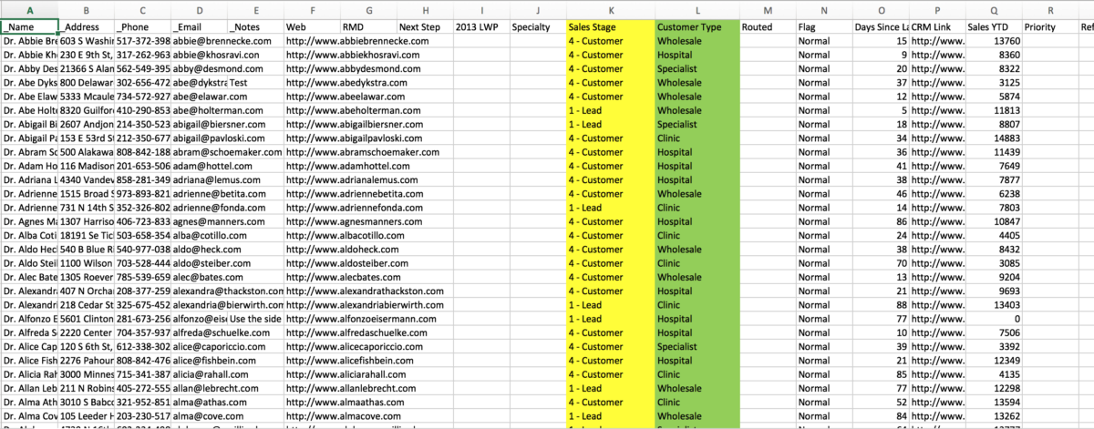
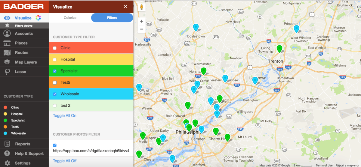
You can colorize the accounts on the map by any of these attributes. Below, the customers are colorized by Customer Type using the details you included in the spreadsheet column.

Use filters to chose which customers you want to see on the map. Below, the only accounts shown under the Customer Type field are "Specialists" and "Wholesale".
The video below shows you how to use visualization tools to colorize and filter your accounts on the map on your computer.